Context
I worked on a number of design ops initiatives, including uplevelling visual design quality. And there were a few reasons for that:- Based on support feedback, there was a lot of UX confusion caused by UI inconsistencies.
- Our design system was outdated.
- Our brand design team had to waste resources recreating simplified product UIs from scratch for our marketing website because existing ones were not compelling enough.
Finding a starting point
Despite all of those reasons, it was hard to make a case for a full redesign because it would require a lot engineering and design resources, and big changes can often be risky. So to advocate for better user experience, I had to find a safe starting point.Back then another team was working on a brand new product called Series, which is a visual builder for connecting multiple outbound messages together into a unified customer journey.
I made a case with the leadership that Series might be a good opportunity to start evolving our visual quality because:
- It’s a content-heavy and sophisticated product, so it needed a good user experience to ensure adoption.
- It’s less risky to introduce a new visual language for a new product with new components than redesigning an existing one.
- Also, Series was shaping out to be one of our biggest launches of the year so it was easier to argue for better UI quality.
Goals
Apart from business goals for Series, we aligned on a design-specific goal for my involvement which was to differentiate the product through design quality.Process
Visual design is obviously a subjective discipline, so making decisions everyone is onboard with can sometimes be hard. Given that we had only a month for getting all of this done, I wanted to avoid running in circles. So I decided to start with introducing principles to guide our decision making, and after that move on to design explorations.I roughly broke the high-level process down into three stages:
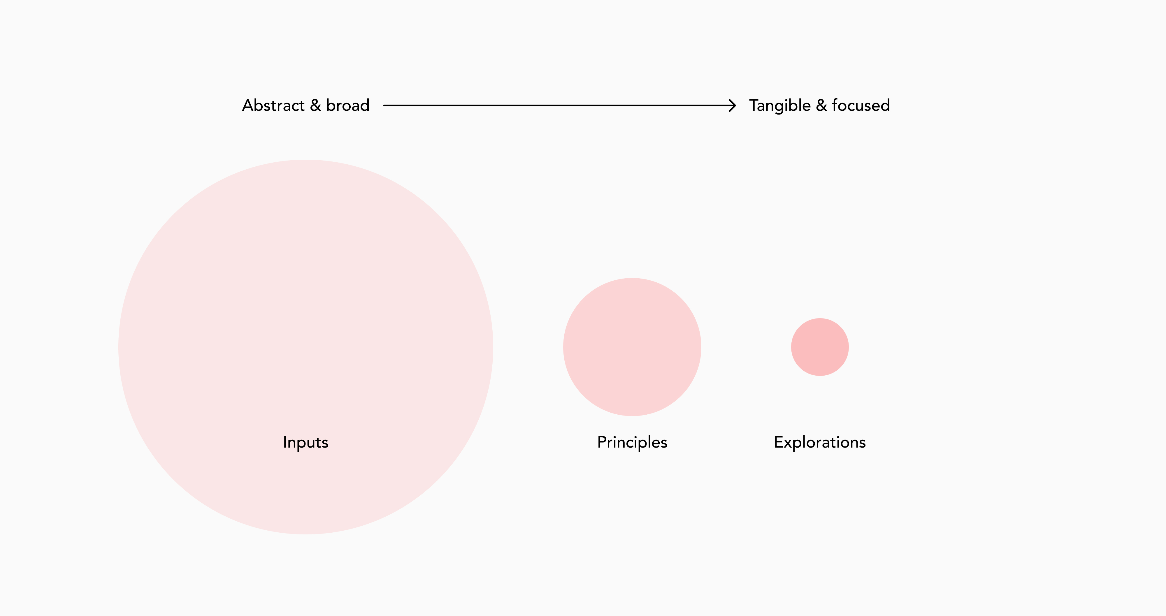
Inputs
First stage was about gathering inputs and building context- I ran an internal workshop to get a sense of how people want our products to look and feel.
- I looked into market analysis, and specifically what customers were saying about competitors design.
- I analyzed our existing design-related customer feedback.
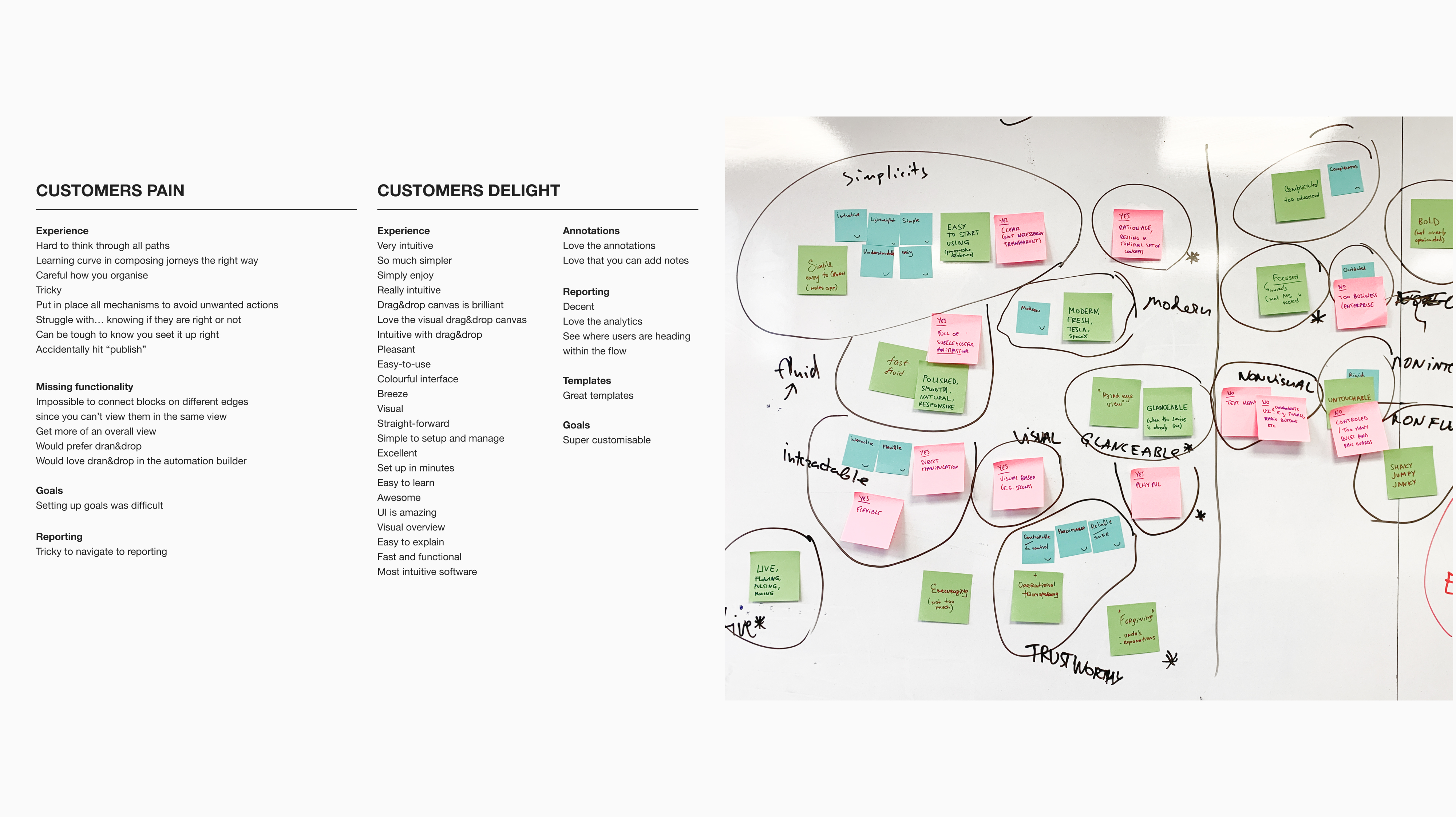
While I was going through all of those inputs, a few distinct themes emerged, but those were not clear enough to guide design decisions. I needed to refine them further into tangible, example-based principles.
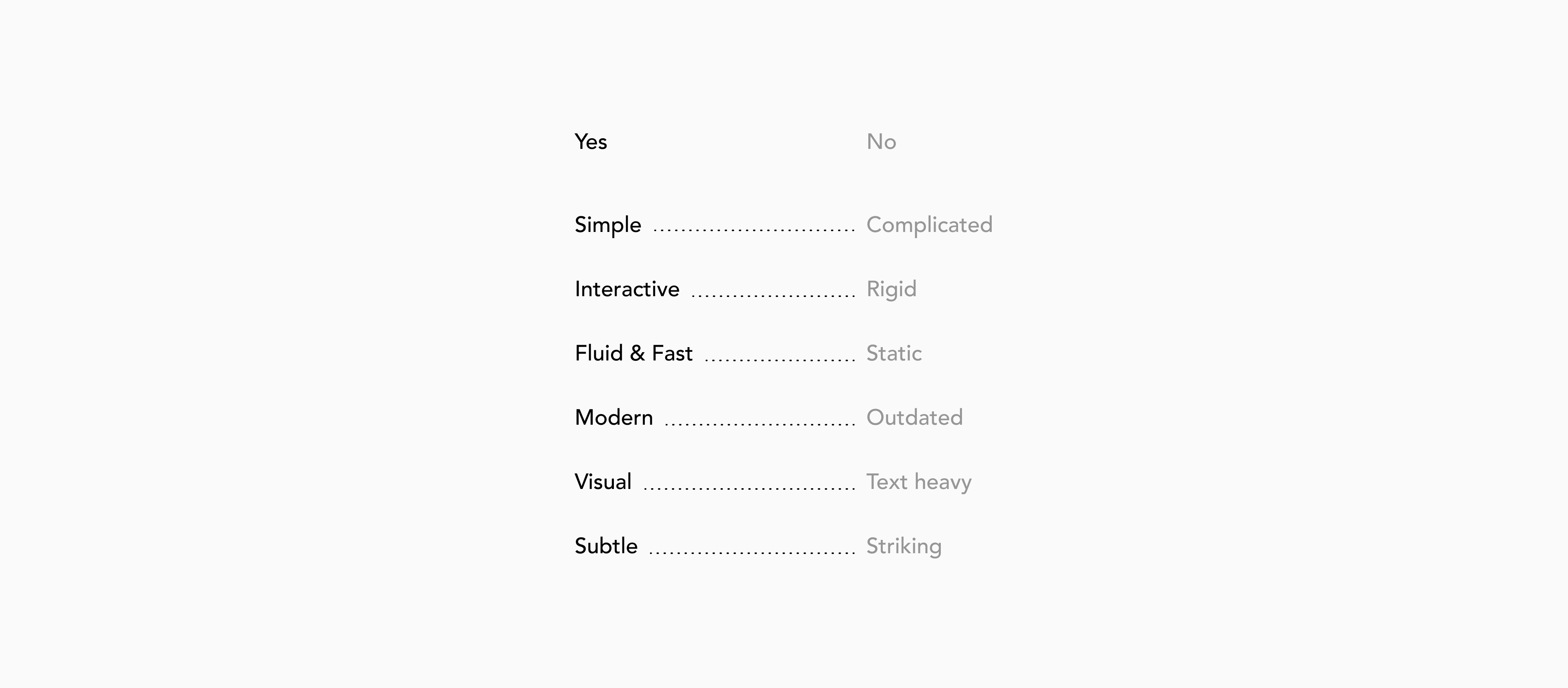
Framing principles
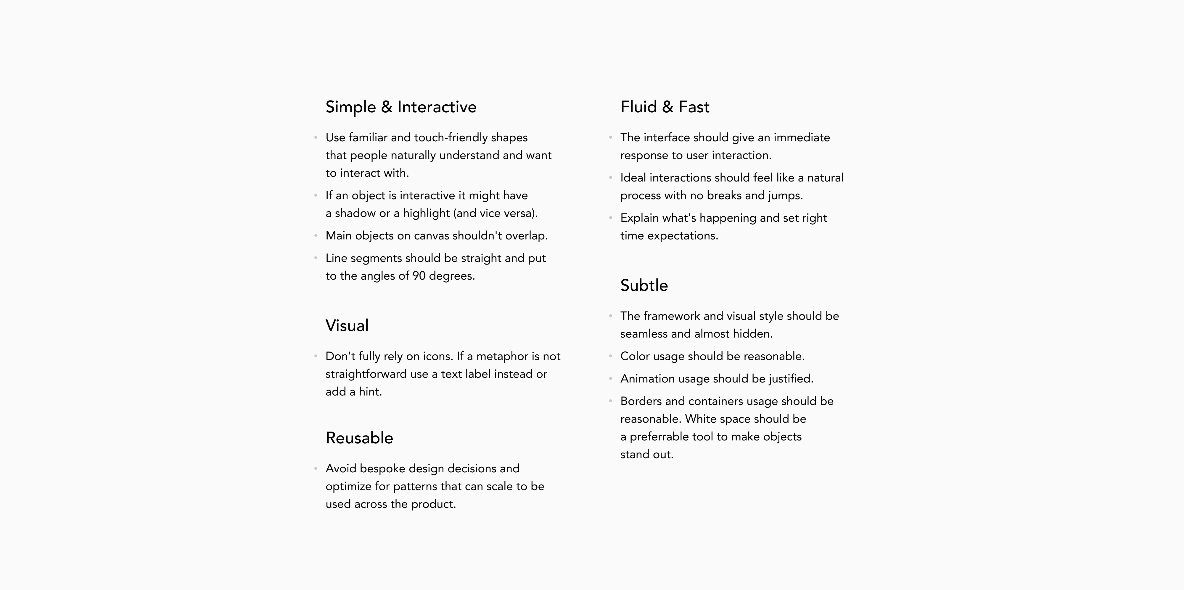
Let me show you one of them. When we say an object is simple and interactive, what qualities do we think of?Simple might mean clear and intuitive so that you understand how things work without any direct explanation. Apple Notes or Dropbox Paper are good examples: you open it, and it's clear what you can do.
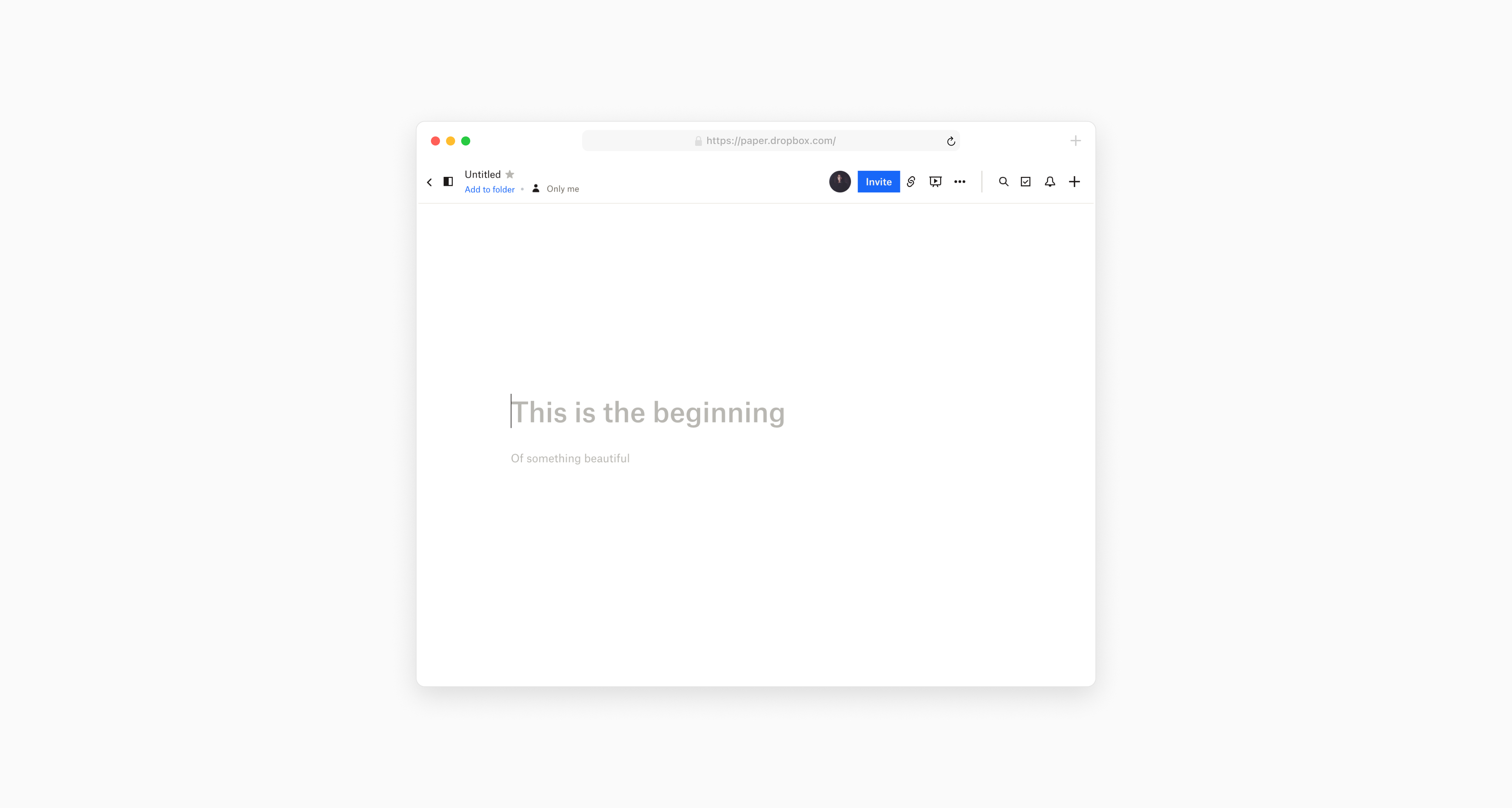
It also means familiar. Objects seem simpler when they're using basic shapes people know and naturally understand. Most of the things we interact with on a daily basis are "made of" rectangles and circles. And when things have unique and sophisticated shapes, they seem more advanced and therefore complicated.
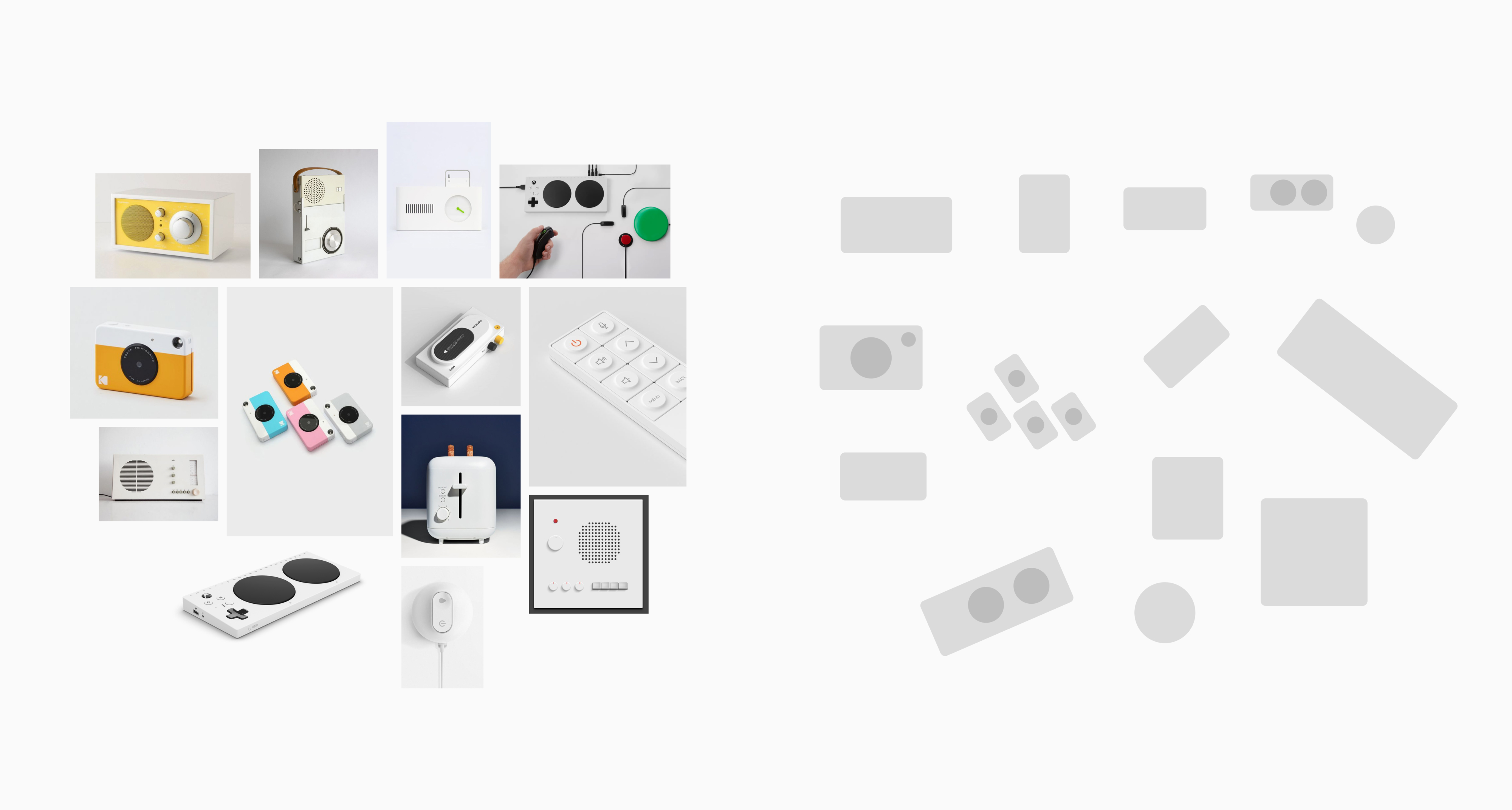
Many physical objects that we like interacting with tend to have touchable shape and soft rounded corners — details that make the interaction experience enjoyable. It also works for digital objects — we subconsciously find interacting with softer interface shapes more pleasant.

It also might mean being responsive or having visual cues like a shadow or changing color in response to user actions.
In a similar way, I went through the rest of the Themes, shared them with the team for feedback, and we ended up aligning on a list of core principles.
Explorations
Then I moved to exploring the overall design and core components: navigation, IA, blocks, edges, colors and interactions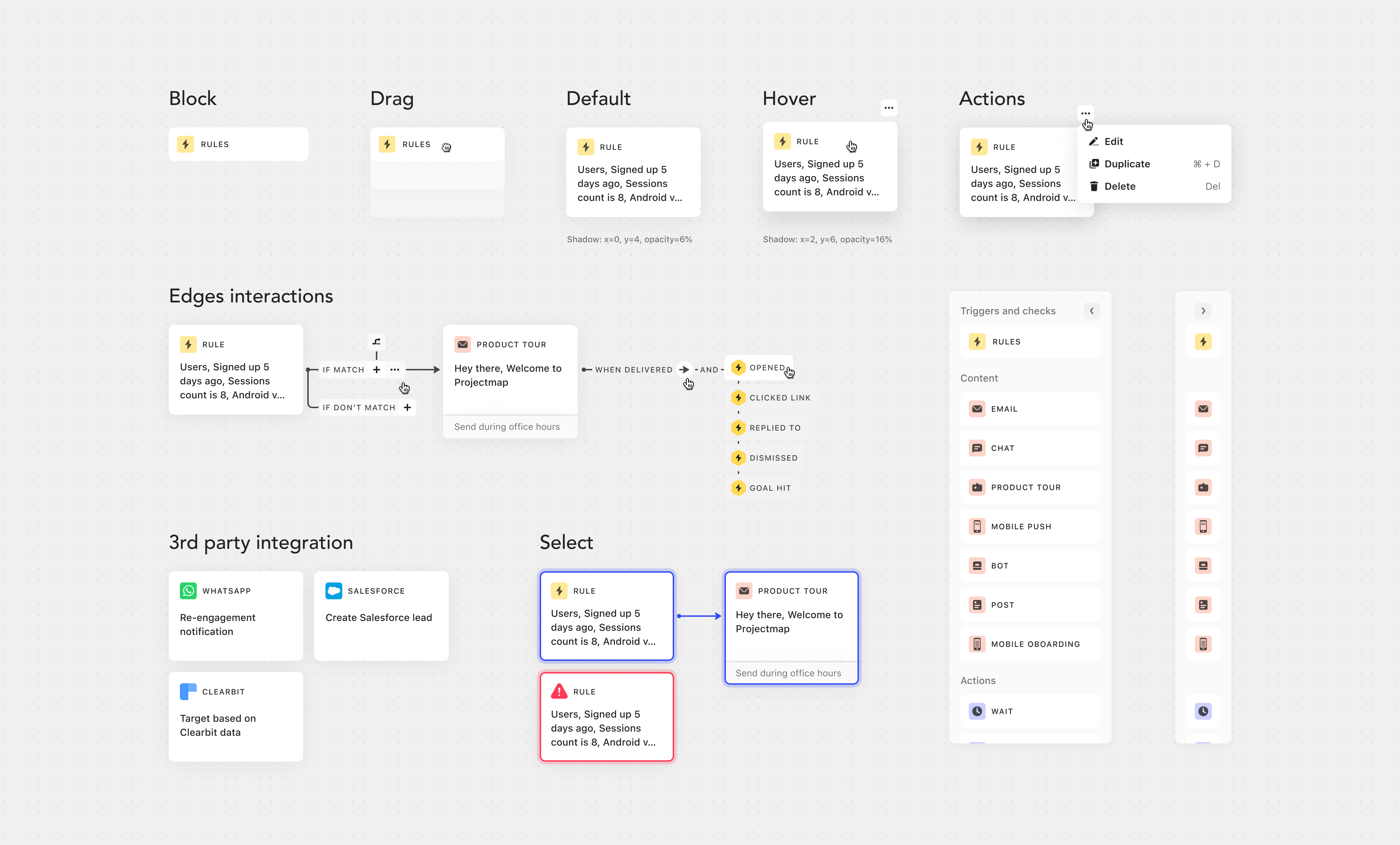
Making decisions
Defining the principles beforehand, helped us move faster and make more objective decisions at this stage. For example, everyone on the team had a different opinion on what blocks should look like. Some of our competitors used blocks with complex shapes and some people on the team were pushing for that direction.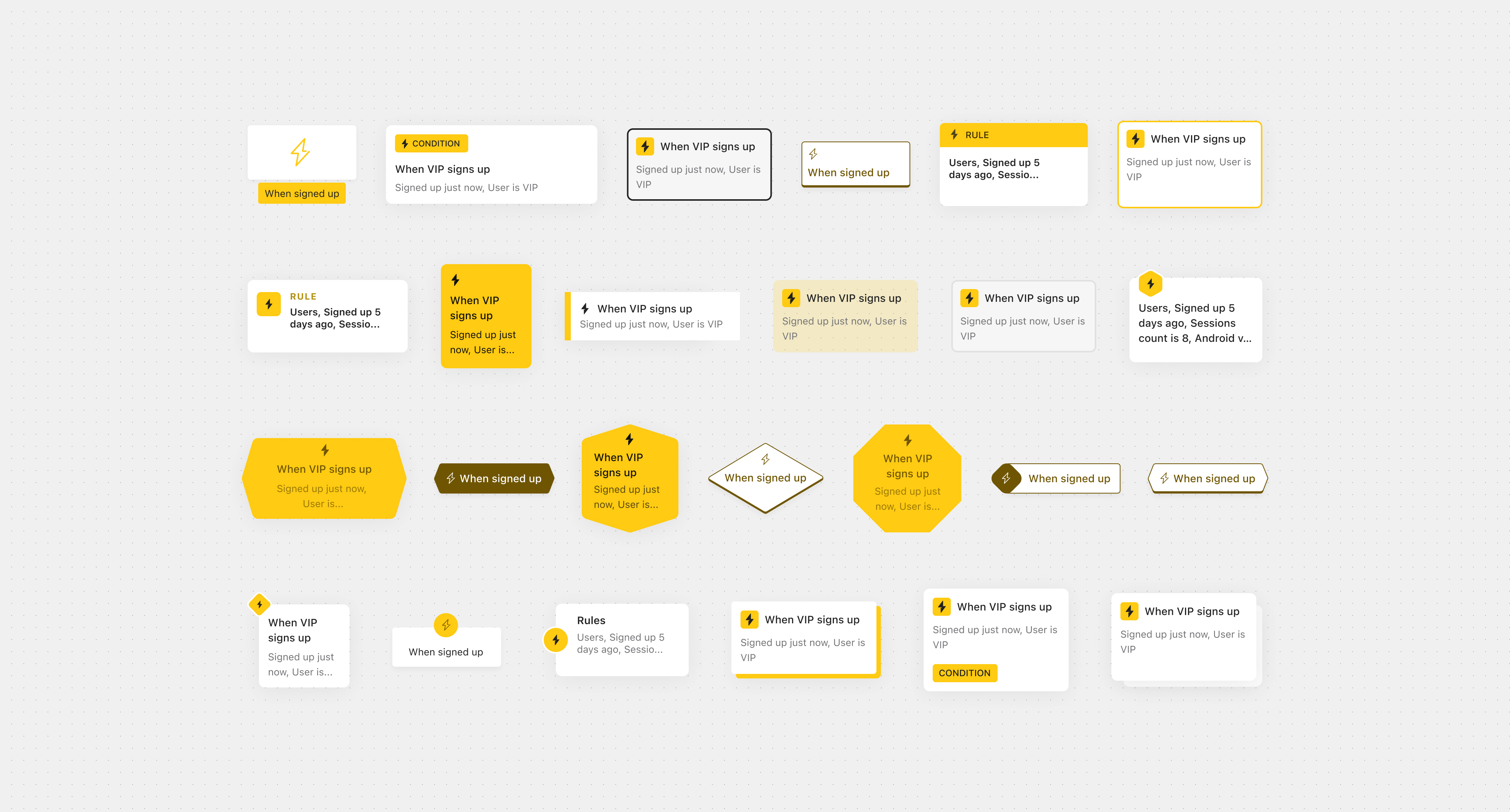
But because we aligned on the principle of using basic and familiar shapes, we were able to discard some of the options that went against it. Likewise, since we had a principle around being subtle, we could easily move away from options with unreasonable color usage. Or because we agreed on making sure our new visual language could scale to the rest of Intercom, we gave preference to options without bespoke components.
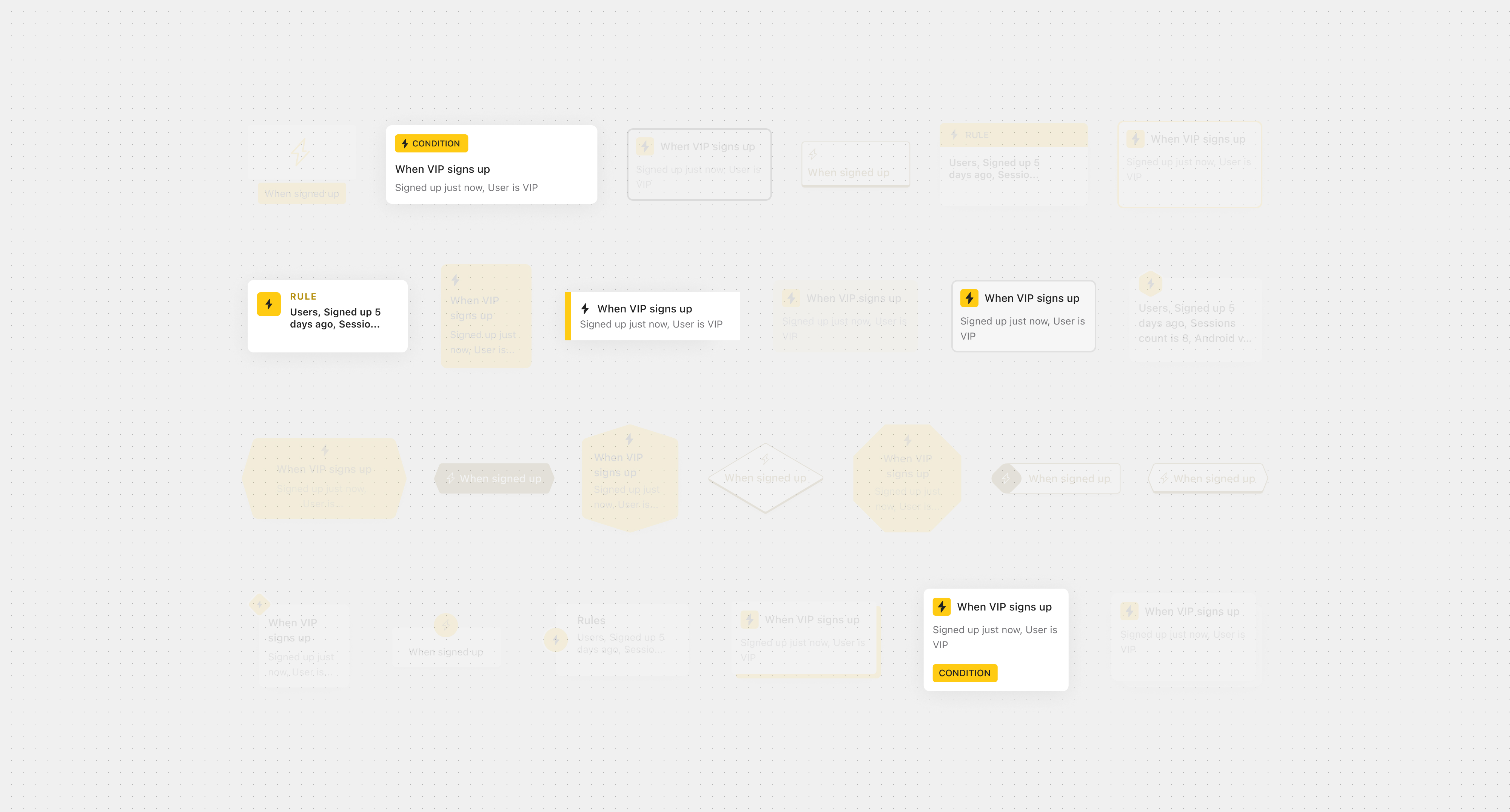
This actually allowed other designers to re-use our block component in a different product.

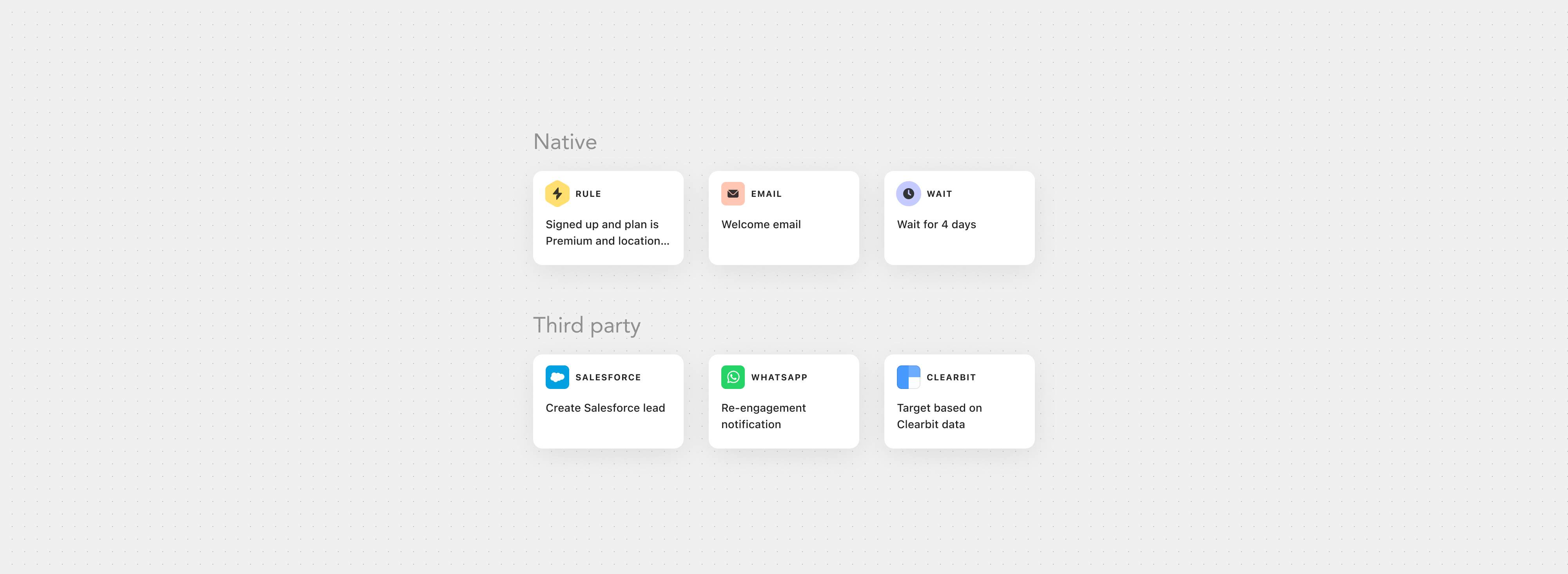
With our principles helping us to narrow down the options, we ended up choosing this direction for blocks.
Result
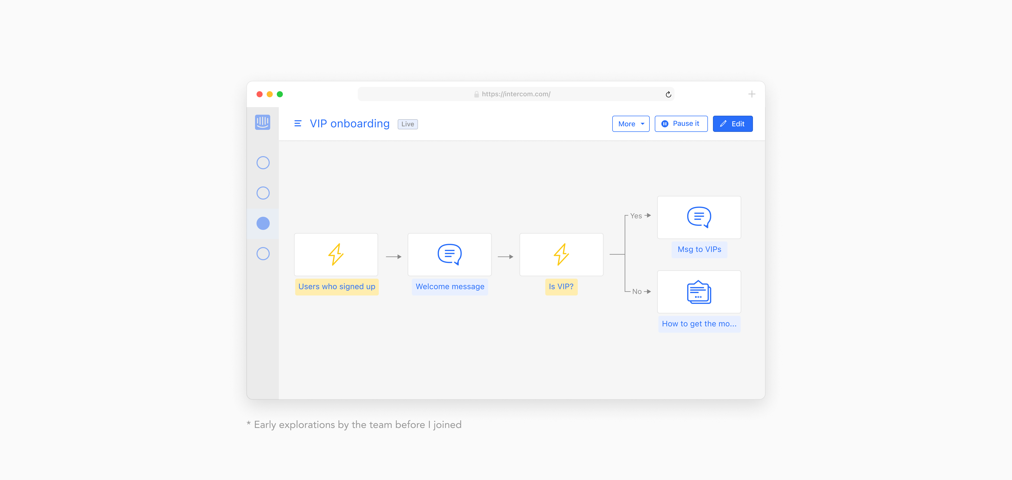
Through similar iterations, we defined the visual design for the whole Series system and its components. This is what the early version of the product looked like when I joined:
This is what we ended up releasing:
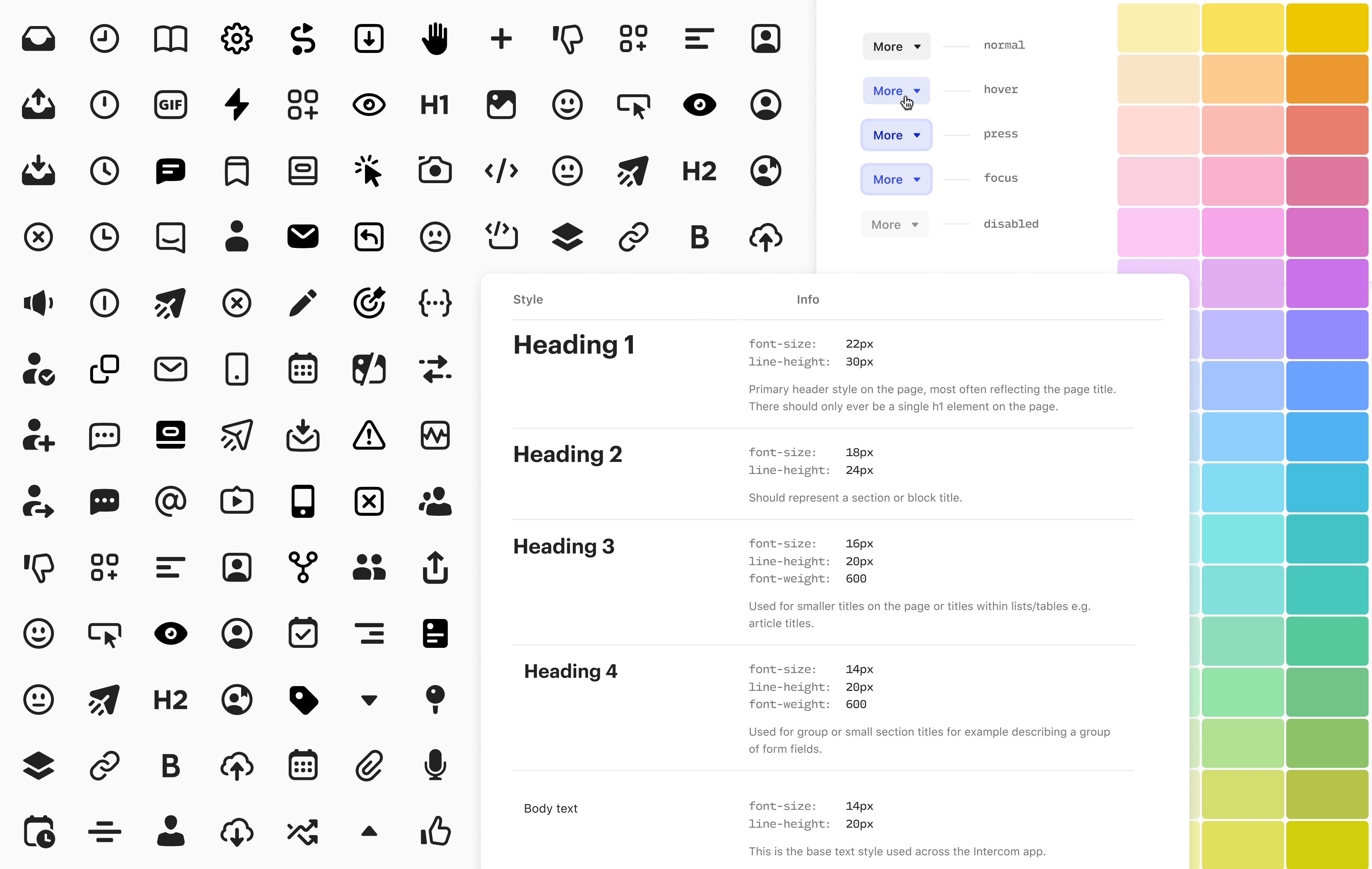
While Series was in build, these new designs were generating a lot excitement in our design team and the overall org. So to build up on that momentum, I made a case for updating some of our design system components using the new visual language and led a mini-working group to implement it.
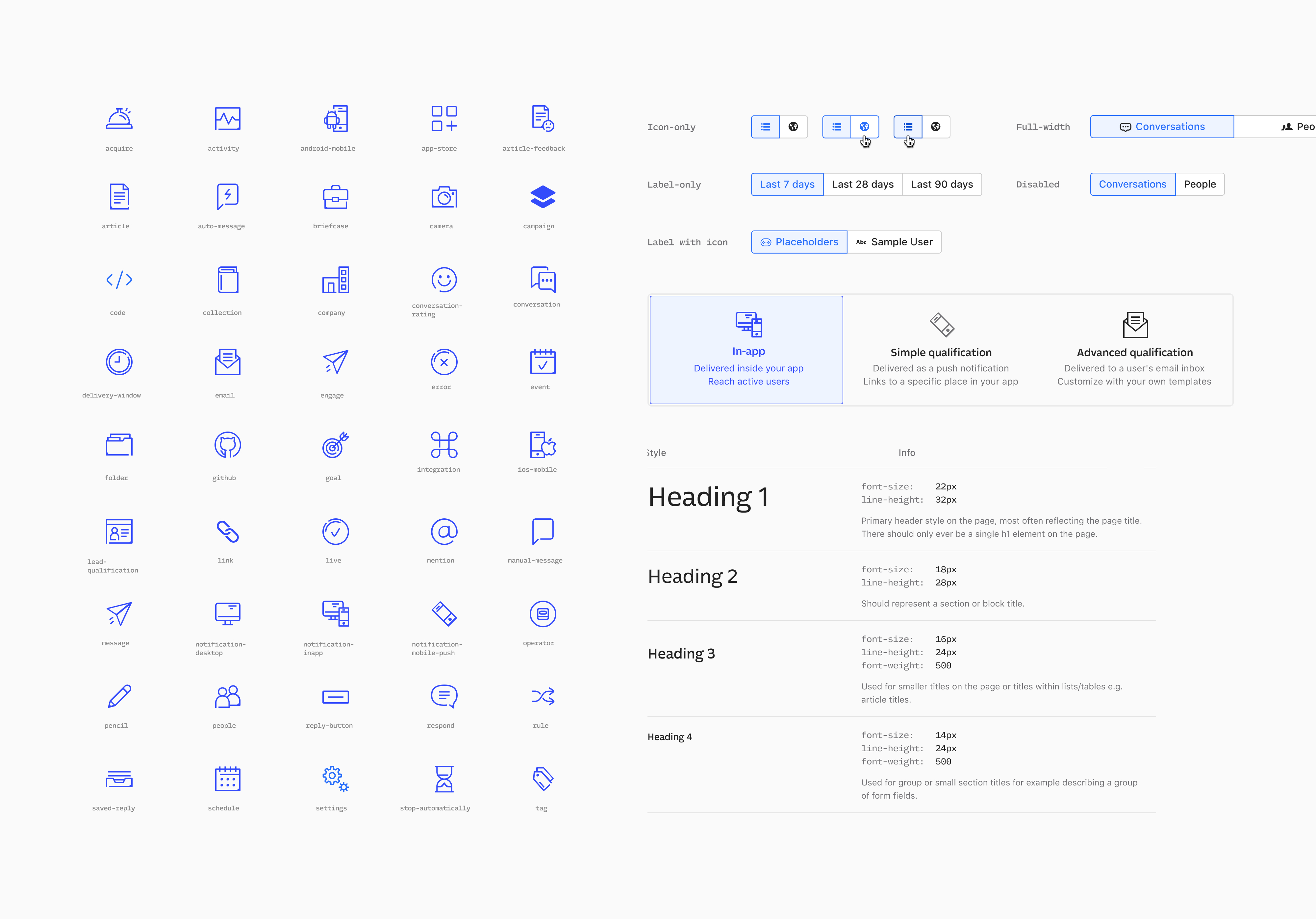
Over the following couple of months, we rationalized and updated many core components like buttons, inputs, typography, colors and I also redesigned the core icon set.
Over the following couple of months, we rationalized and updated many core components like buttons, inputs, typography, colors and I also redesigned the core icon set.
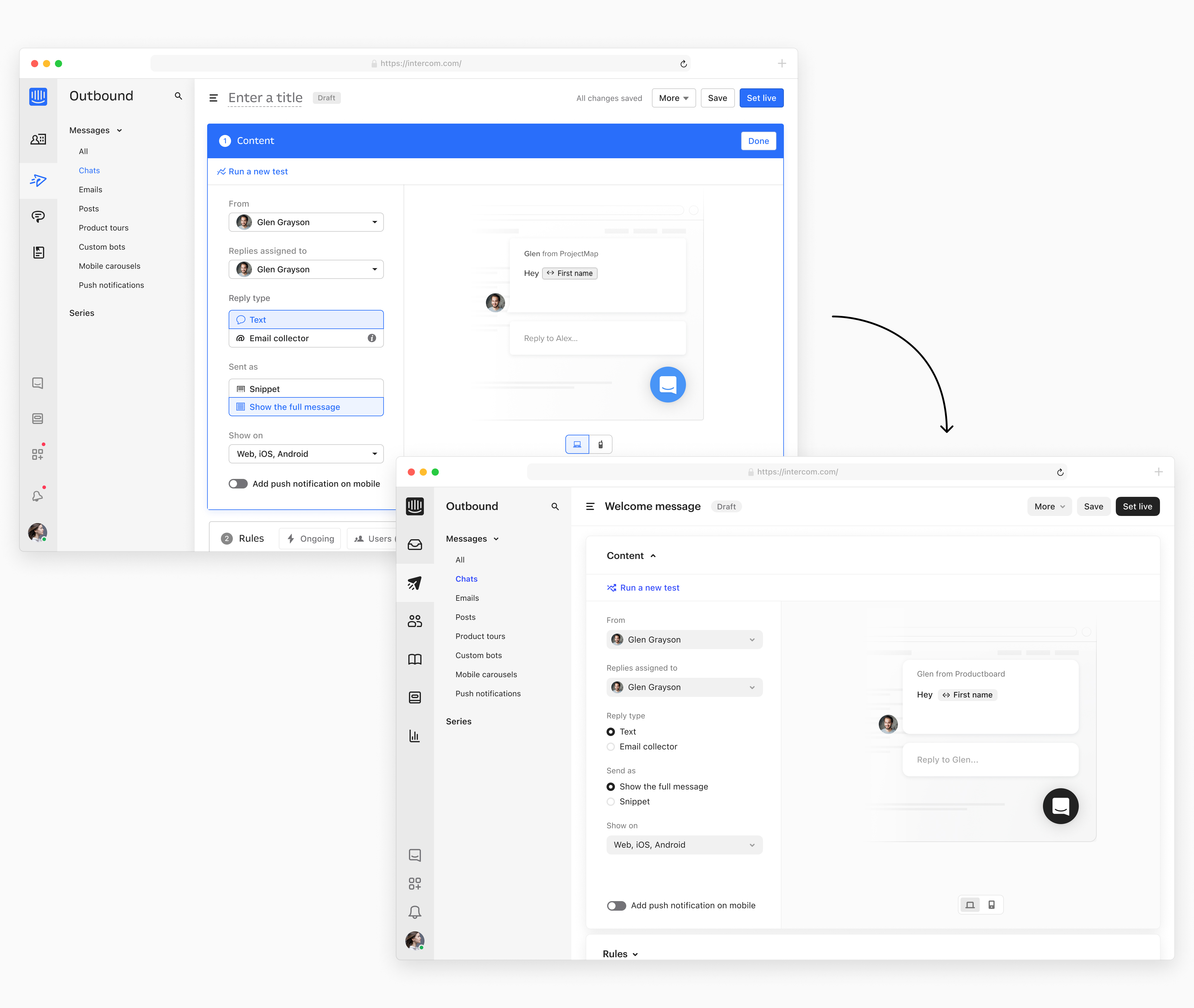
Here’s an example of one of the product screen before and after we updated core design components.
Outcomes
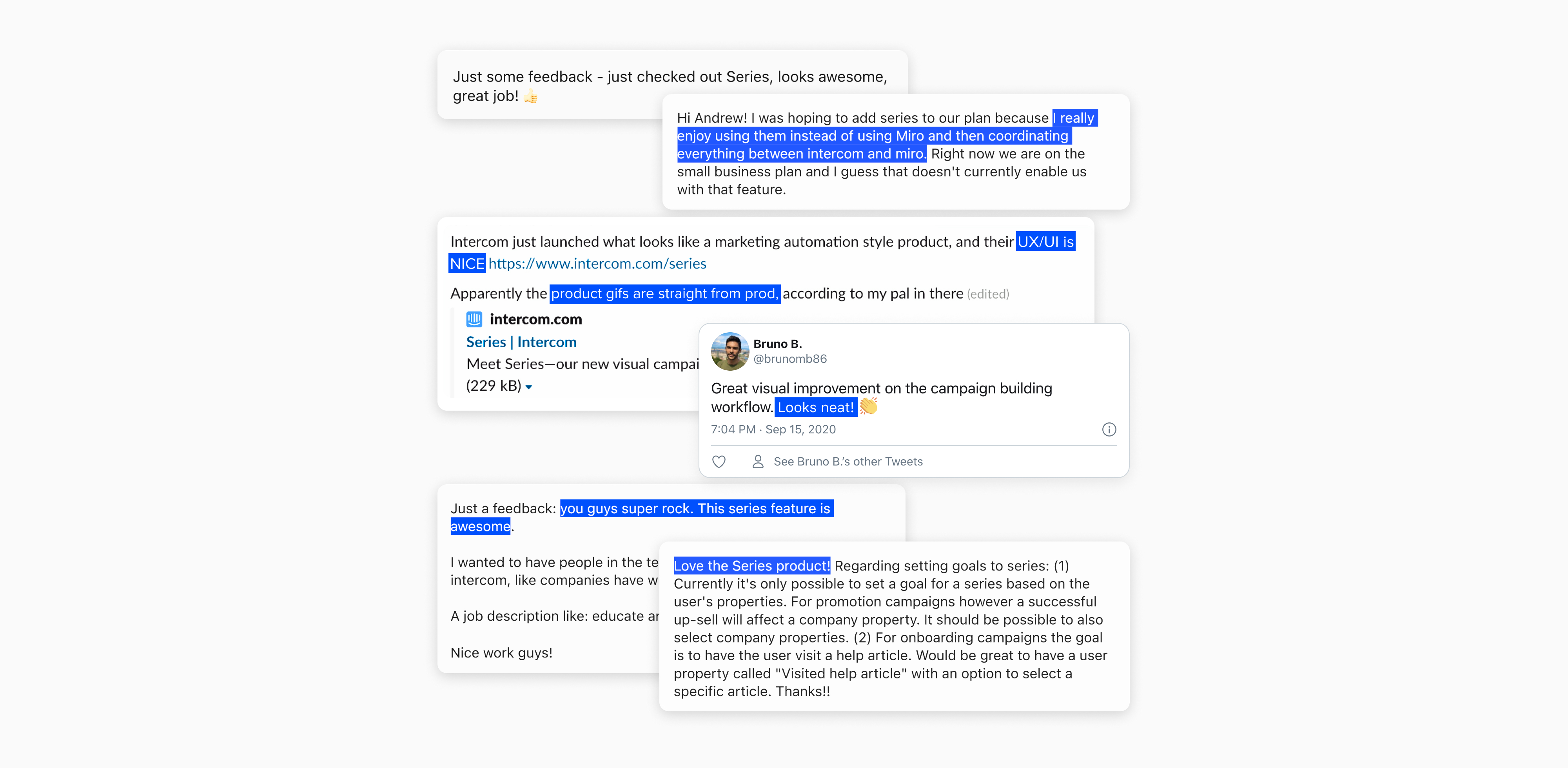
When Series was released, apart from successfully hitting its business goals, there were a couple of design-specific outcomes that I wanted to call out:- We received very positive feedback from customers and the market.
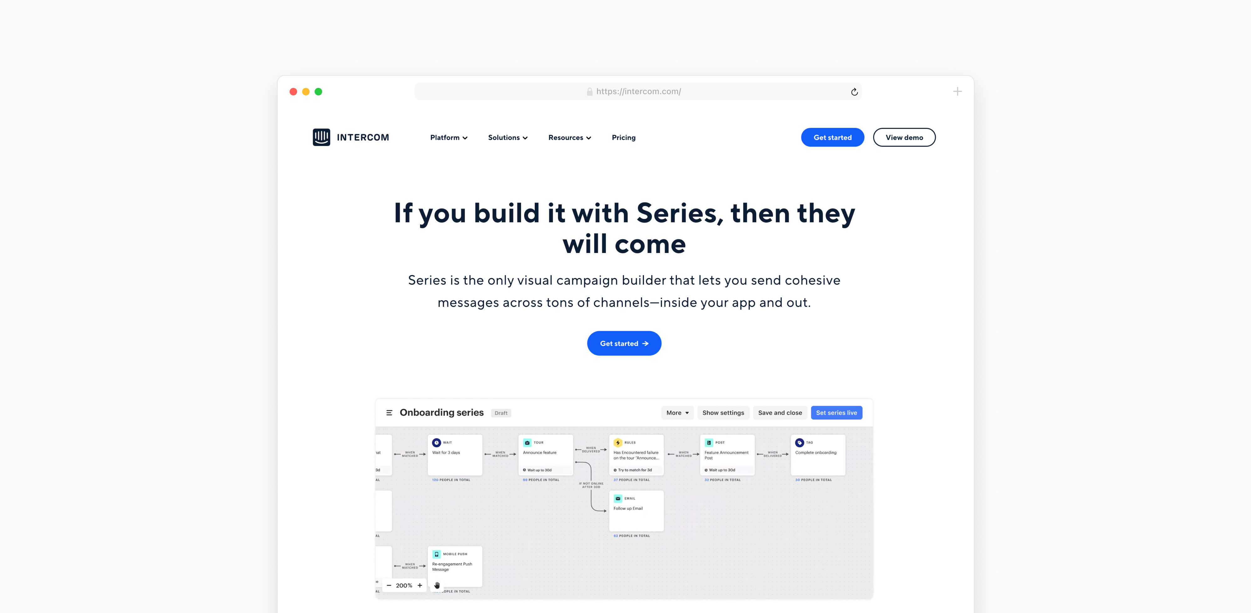
- It was the first time we used the assets that are very close to actual product UIs on the marketing website.
- The research we ran next year found that design was one of the top reasons customers were choosing Intercom, and Series was explicitly called out.
- The new design patterns were widely adopted in the design team and are still in use across the product.
