Maps IA & Place cards
Yandex Maps is a web mapping service. It offers information about places, route planning, real-time traffic conditions, street maps and satellite imagery. Yandex.Maps is the most popular cartographic service in Russia, with about 11.5 million users in Russia per month, and over 20 million worldwide.Problem & Goal
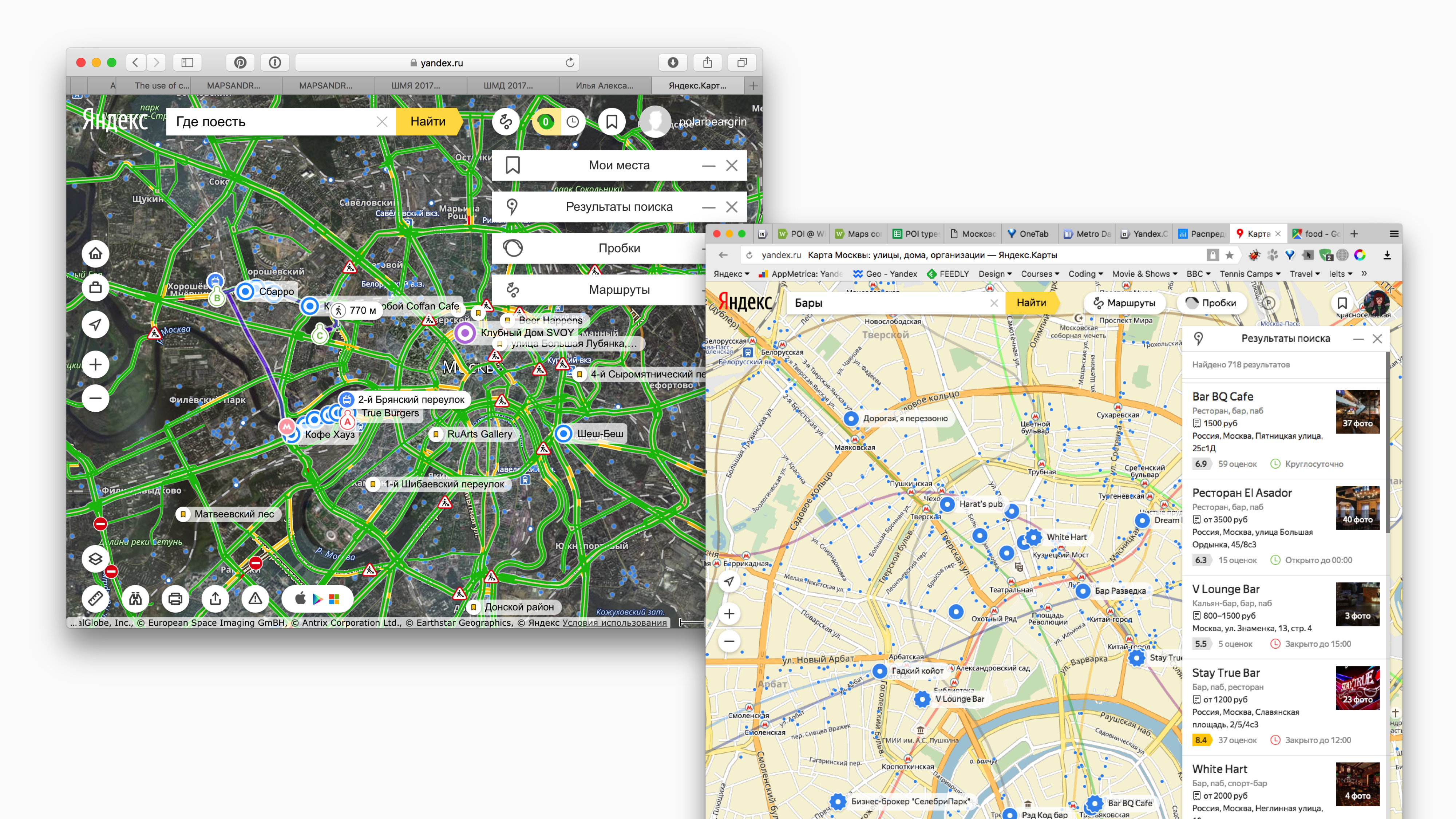
- Over the years Maps evolved from a relatively simple tool helping you navigate from point A to B to a complex product where you can discover places, get any information about them, order food or book a table. The existing design didn't support all the jobs Maps were capable of, and the product needed both UX and visual rethinking.
- Research and users feedback proved that the existing UX was poor: essential interface parts were disconnected (search bar on the left, search results on the right, and placemarks on a map in the centre of the screen). As a result, people had to spend more time to complete simple tasks.
- The interface was extremely outdated and cluttered with various controls randomly placed all over the screen with no hierarchy and order.
- Map layer itself had hight contrast and was too saturated to allow placemarks (icons), labels, traffic or any other data layer stand out visually.
New IA & Layout
We (design team and two PMs) outlined the problems, research findings, and did a series of brainstorming sessions that helped us define fundamental principles and ideas for further design explorations. Considering the audience size (~11,5 monthly active users) and how sensitive any changes might be, the whole redesign process was broken down into a series of small iterations. Each of them included broad design explorations, user testing, iterations, experiments and release.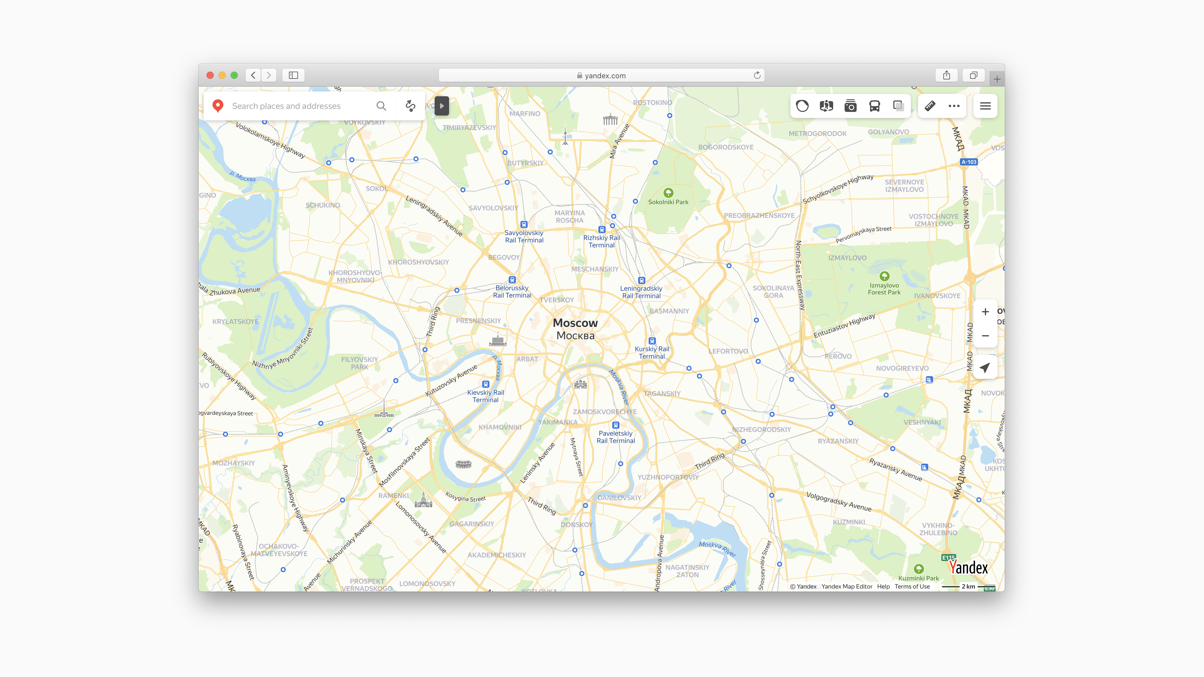
Place Card Overhaul
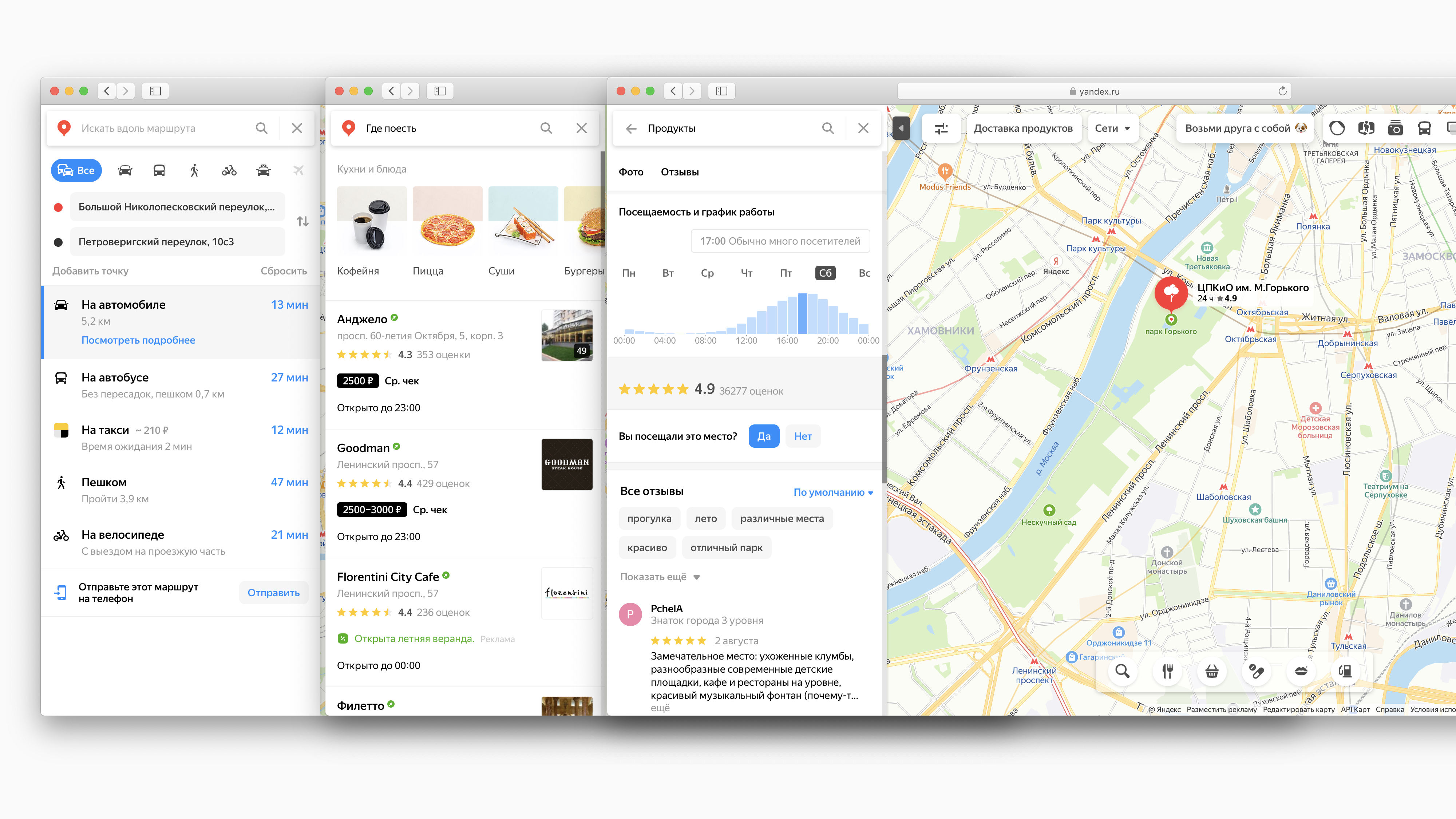
One of the projects in this series that I was responsible for is a place card redesign. Places or businesses are the core of the product. Maps are responsible for the whole user experience from an intent ("I want a tomato soup", "I need to find a car park", or "I need a drugstore that works at night") to task completion (i.g. Get to the airport, find the nearest open drugstore, etc.)Problem & Goal
- The existing place card format was not able to showcase many business properties like image gallery, restaurant menu, services, facilities. We needed to ensure that all this information can be easily found and look good.
- ATM, Restaurant and drugstore have different details or features people are looking for. We needed to find a layout for each type of place that would serve its job best.
Process & Result
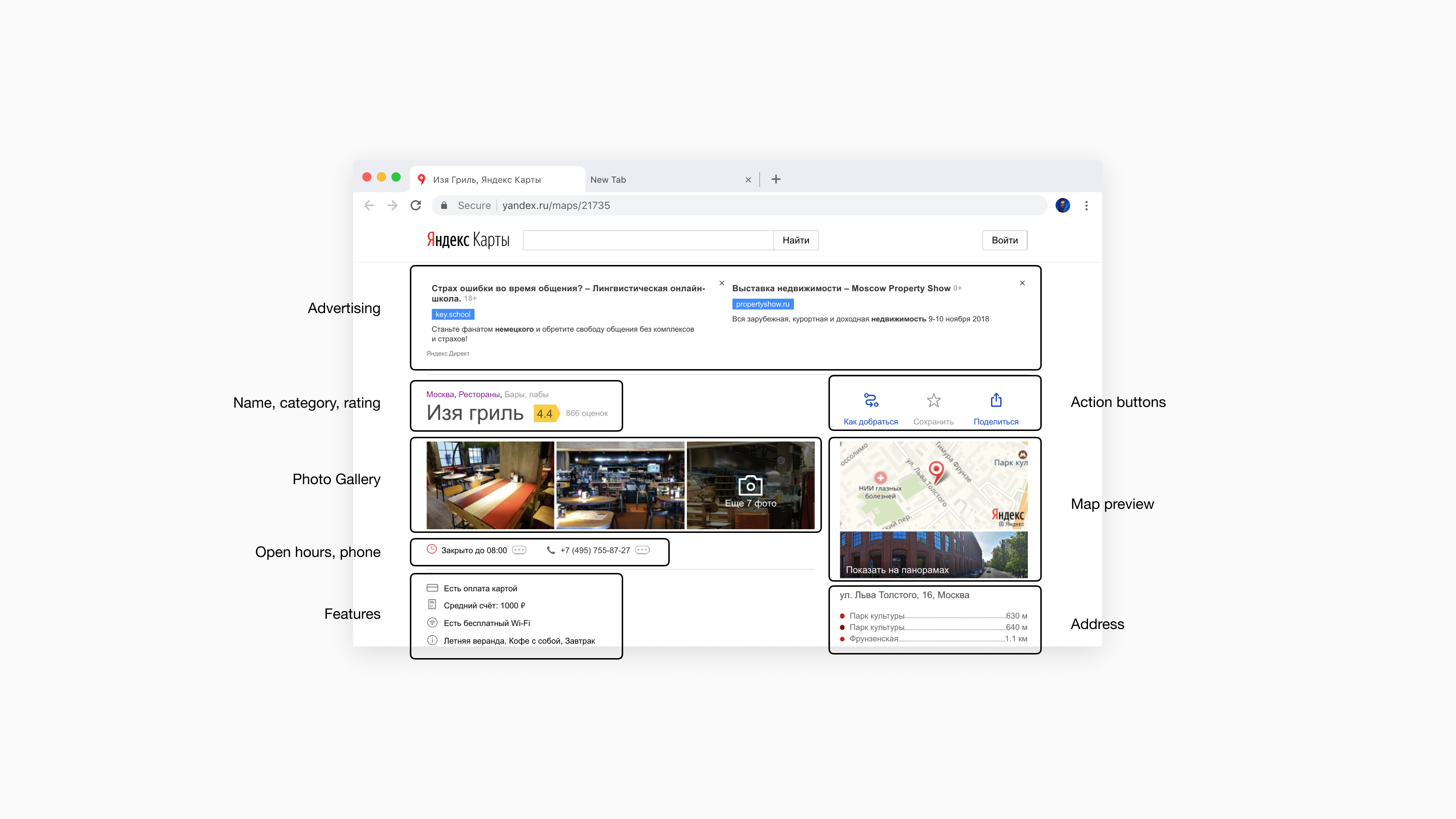
First principles derived from the way people use interface and map when looking up different places. For example, when searching for an ATM or a gas station, their place on a map (how far they are and how long it takes to get there) is a key to choosing one option from the list of search results. At the same time, when choosing a restaurant or a barbershop, people are more engaged with content, i.e. photos, menu, services and open hours.We introduced two types of layout: a wide card that takes generous screen space for "content-first" places and a narrow one for places where content is less important than a map.
The design I proposed was built up from modules—vertical stack of blocks in a particular order, where each block represents a single type of information like a photo gallery, contact details, reviews etc.
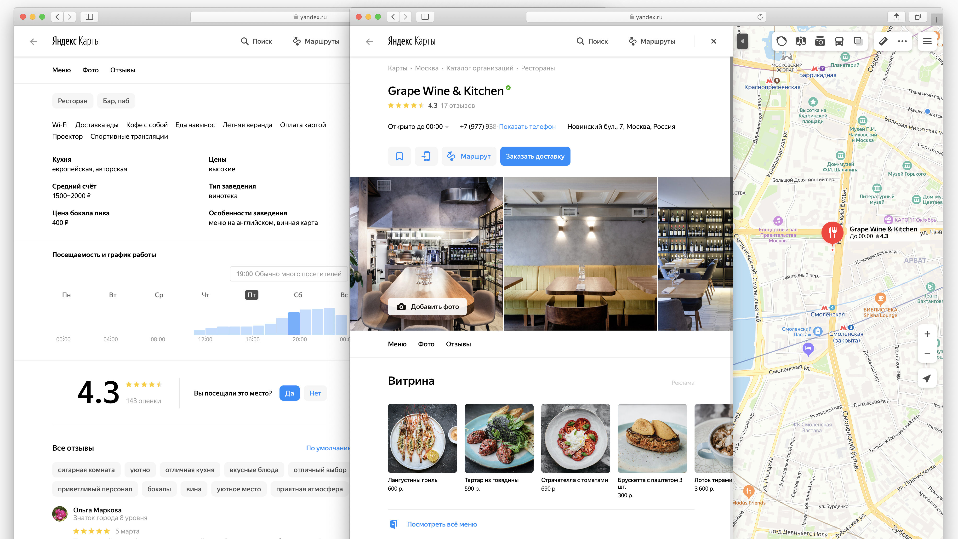
Maps is a free product where advertising is one of the primary revenue sources. The modular design allowed us to fit the advertising blocks in the layout in a less distracting way that it used to be before.
All those changes were released iteratively through a series of experiments. As a result of this work, we significantly improved UX, look and feel and increased content engagement (page-views, session time, scroll depth) while keeping the revenue from advertising at the same level (which was one of the critical success metrics).
All those changes were released iteratively through a series of experiments. As a result of this work, we significantly improved UX, look and feel and increased content engagement (page-views, session time, scroll depth) while keeping the revenue from advertising at the same level (which was one of the critical success metrics).